10 developer tool homepages that get one thing right
Learn what the best developer tool homepages get right, and apply those lessons to your own homepage or landing page.

Can you imagine putting a Rickroll on your homepage?
Supabase did. Back in 2021, visitors landed on the homepage expecting to learn about an open source backend. Instead, they were greeted with a Rick Astley video beside the hero copy.
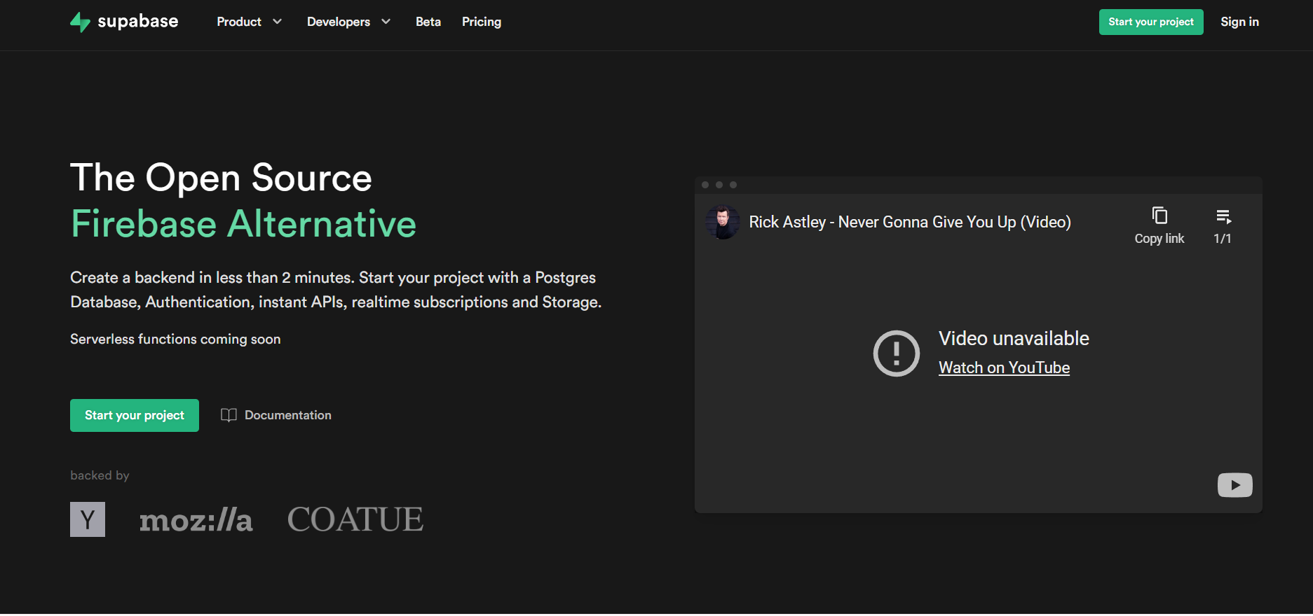 It sounds like a terrible marketing decision. It was not.
That Rickroll communicated something a feature list never could. It showed that the people building Supabase shared the same internet culture as the developers they were building for. Before anyone read about Postgres, authentication, or storage, they had already formed an opinion about the company.
PostHog follows the same philosophy today. Its operating system-inspired homepage breaks years of conventional CRO advice, yet developers remember it because it has conviction. The jokes, easter eggs, and interactions never get in the way of the job. They reinforce the brand instead.
 This is what the best developer tool home pages understand. Developers don't remember every section they scroll through. They remember the one decision that made the product click. Whether it's a product they can use immediately, a claim they can verify, or an interaction they didn't expect, that one moment shapes how they remember the company.




Inside the launch of VectorAI DB
How Actian positioned VectorAI DB for developers and drove adoption from day one
Read the case study
But there is another audience reading the page now, and it does not have feelings at all. AI agents are landing on these sites too, sent by developers to evaluate, integrate, and even buy on their behalf. They do not care about a rickroll or a hedgehog. They care whether the page is structured, parseable, and clear enough to act on. One company in this list detects AI agents server-side and serves them a completely different page
This article breaks down the best devtool homepages and the one thing each one gets right. Find the move your home page or landing page is missing and steal it.
1. Linear: The product is the hero
Key takeaway: Show developers exactly what they'll be using.
Most devtool home pages tell you what the product does. Linear shows you what using it feels like.
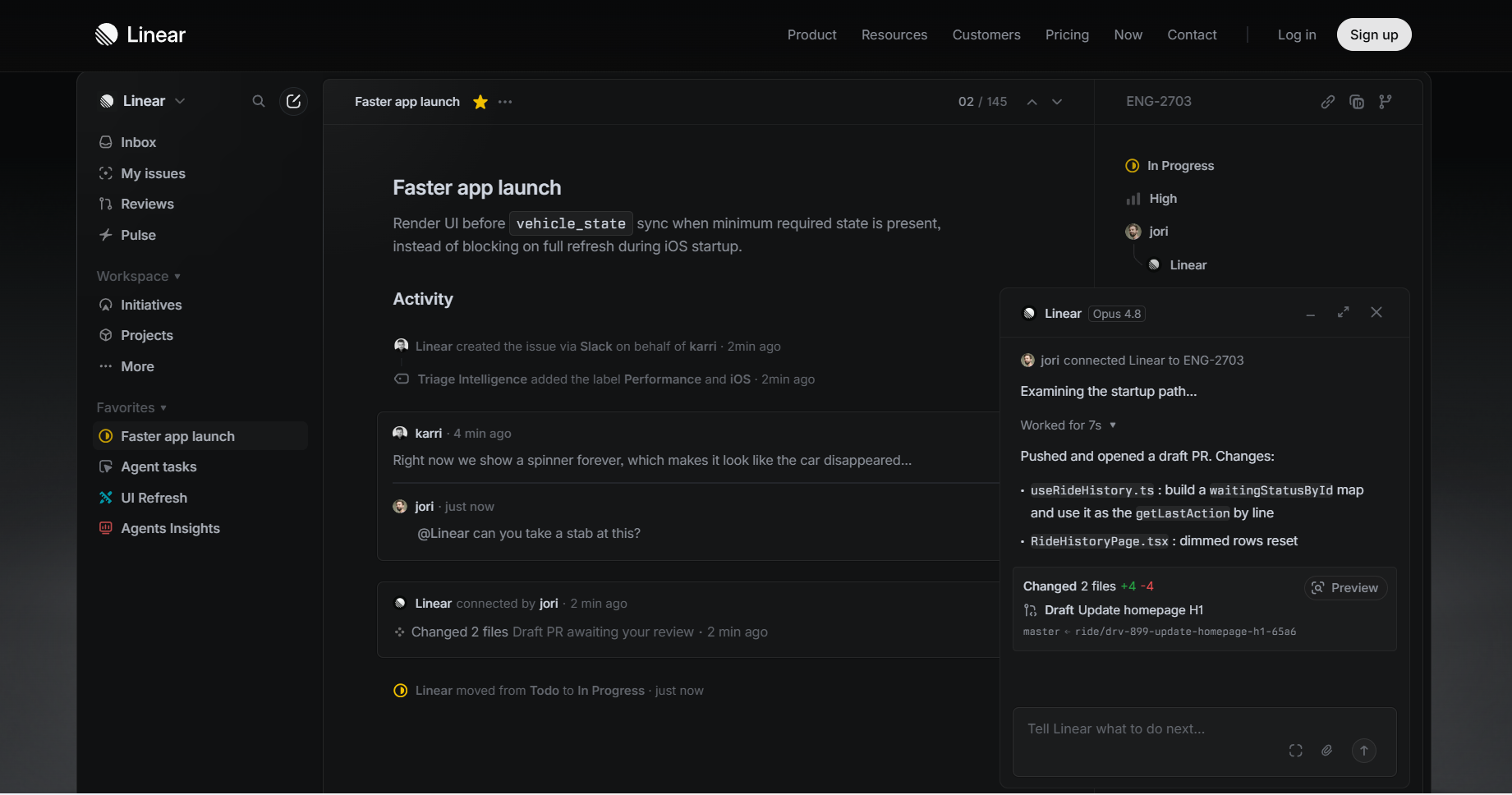 The homepage is almost entirely the product. You can see an issue being discussed, work moving forward, and AI helping with the task. By the time you finish the hero, you already understand how Linear fits into your workflow.
That matters because developers picture themselves using a tool before they decide to try it. Linear removes that mental work. There is nothing to imagine because the product is already doing the explaining. Many devtools lean towards this appraoch, a few worthy mentions: Framer, Resend, Retool, Warp etc.
Steal this: If your product has an interface, let it sell the product. Show developers the experience, not a marketing illustration.
2. Bun: Answer the first three questions
Key takeaway: Tell developers what your product is, why it matters, and how to try it within seconds.
Every developer arrives at a homepage with the same three questions. What is this? Why should I care? How do I get started?
Bun answers all three before you scroll.
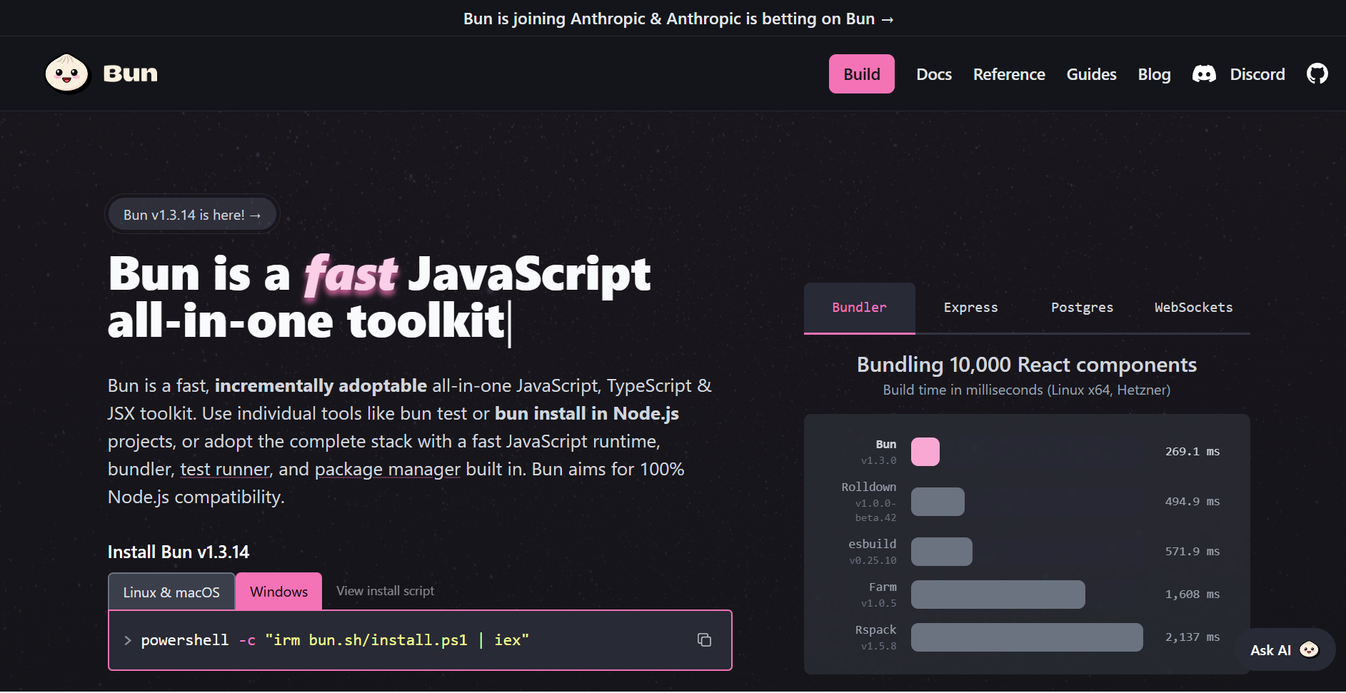 The headline tells you exactly what Bun is: "A fast all-in-one JavaScript runtime." The subheading explains what it replaces. Right below it is the install command. You can understand the product and start using it in less than thirty seconds.
Steal this: Your hero should answer the first three questions every developer has before asking them to do anything else.
3. Better Stack: Position against the market leader
Key takeaway: If you compete in a crowded category, anchor your positioning to the product everyone already knows.
Better Stack knows most of its visitors are not evaluating observability tools for the first time. They are already paying for something, usually Datadog, and usually annoyed about the bill.
That is why the hero does not start with features. It starts with a comparison.
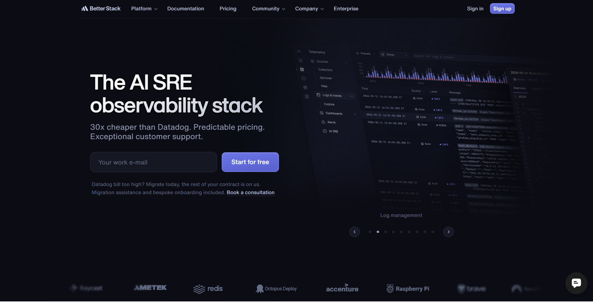 That single sentence immediately tells visitors who the product is for and why they should care. You do not need to understand Better Stack yet. You only need to know your Datadog bill is about to become much smaller.
The same idea continues below the CTA. "Datadog bill too high? Migrate today, the rest of your contract is on us." Better Stack knows switching feels expensive, so it removes that objection before you ask the question.
Steal this: If you compete in a crowded category, prospects are already comparing you to the market leader. Frame that comparison around your strongest advantage.
4. Raycast: Let your users teach the product
Key takeaway: Feature customers who teach visitors something about your product.
Raycast gives its users space to explain how they use the product. Every profile shares practical details like favorite hotkeys, extensions, AI prompts, and daily workflows. Those answers help visitors discover features they might have otherwise missed.
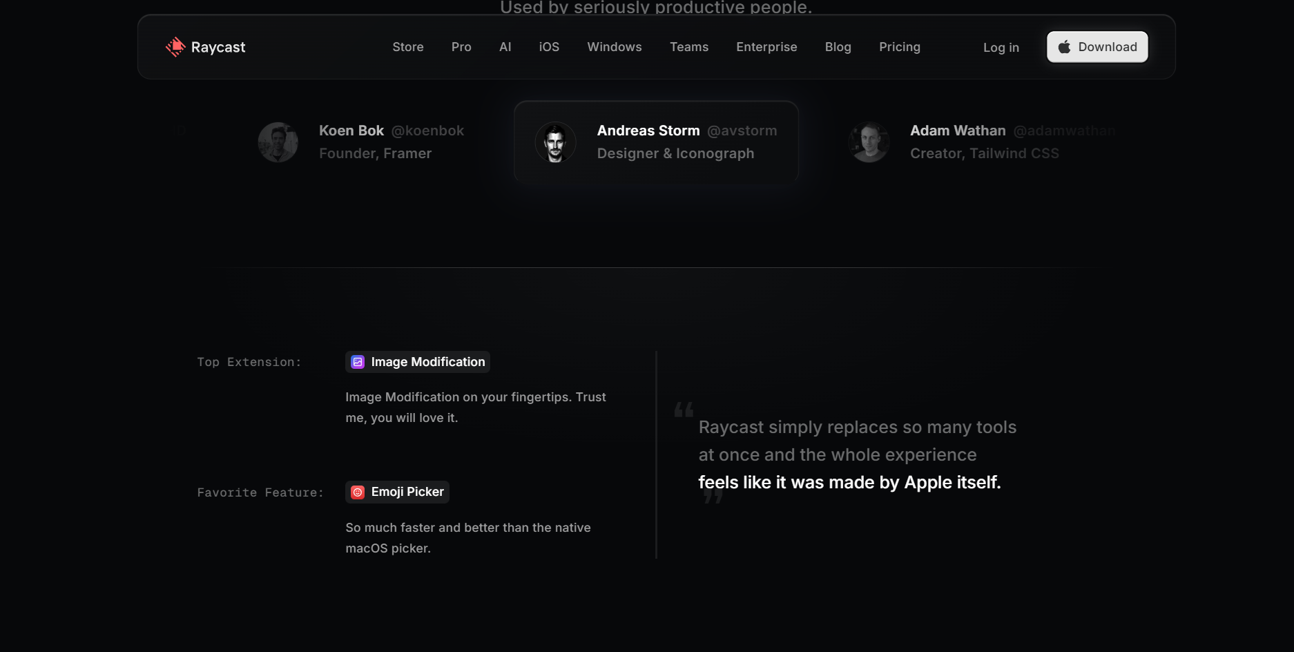 The section keeps you exploring. You click through different people because each one has a different way of using Raycast. A designer, a founder, and an engineer all solve different problems with the same product. By the time you finish reading a few stories, you have learned new ways to use Raycast before downloading it.
Steal this: Ask your customers how they use your product and showcase their answers on your homepage.
5. Sentry: Turn your positioning into an interaction
Key takeaway: Don't just claim your positioning. Build it into the experience.
Sentry lets visitors switch between Marketing Mode and No Marketing Mode. Marketing Mode looks like a traditional homepage. No Marketing Mode removes the value propositions, logo strip, and marketing copy, and takes developers straight to a product-focused interface where they can ask questions about setup, troubleshooting, features, and recent changes.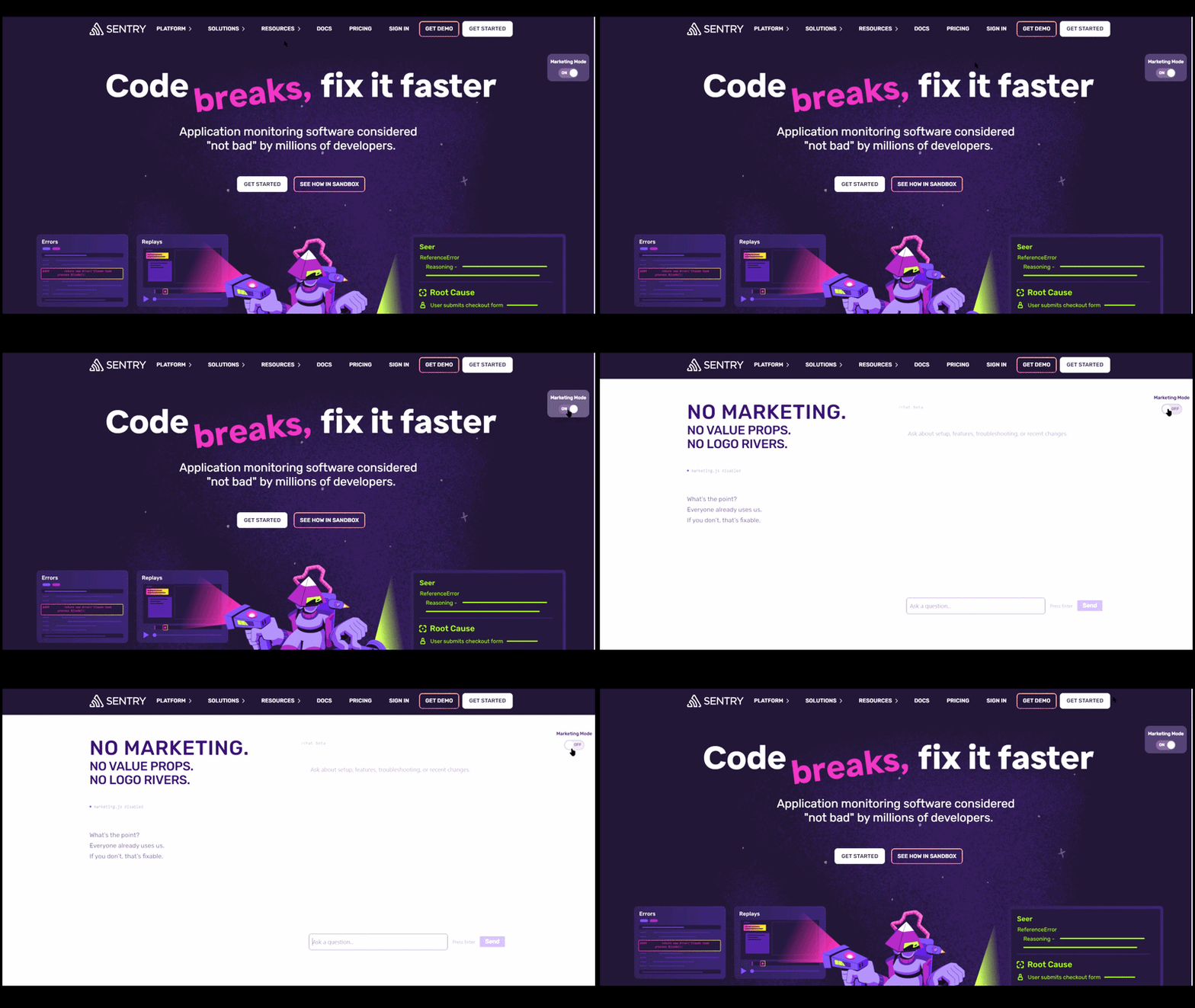 Instead of only telling developers they are developer-first, they built an interaction around that idea.
Steal this: Turn your biggest positioning into something visitors can experience. If you say your product is simple, prove it. If you say it is developer first, let people feel it before they sign up.
6. Trigger.dev: Bring your highest-value documentation to the homepage
Key takeaway: Feature the documentation pages developers actually search for.
Trigger.dev pulls the most valuable implementation guides out of the docs and promotes them on the homepage. Every card represents a production pattern, includes a visual architecture, and links directly to the complete guide.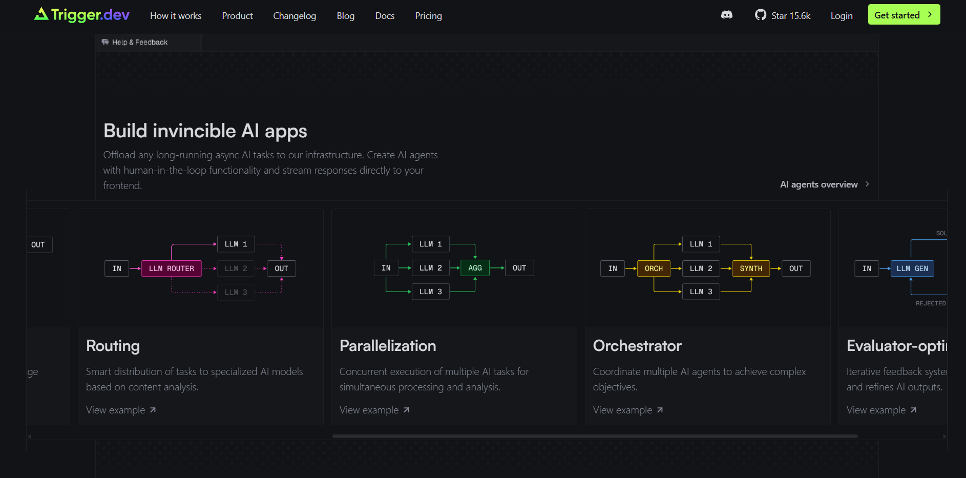 Instead of asking developers to browse the documentation, Trigger.dev surfaces the pages that help them build something immediately.
Steal this: Open your analytics and find the documentation pages developers visit the most. Feature those guides on your homepage with a diagram, a one-line explanation, and a direct link to the implementation. Your best documentation shouldn't be buried three clicks deep.
7. tldraw: Remove the homepage
Key takeaway: Let developers use the product before asking them to learn it.
The first thing you see on tldraw.com isn't a homepage. It's a fully functional canvas. Within seconds, you've already experienced the product instead of reading about it.
Once you've tried it, clicking the tldraw logo takes you to the marketing site, where you can copy the npm create tldraw command, explore the SDK, browse examples, and dive into the documentation. The marketing site exists after the product experience, not before it.
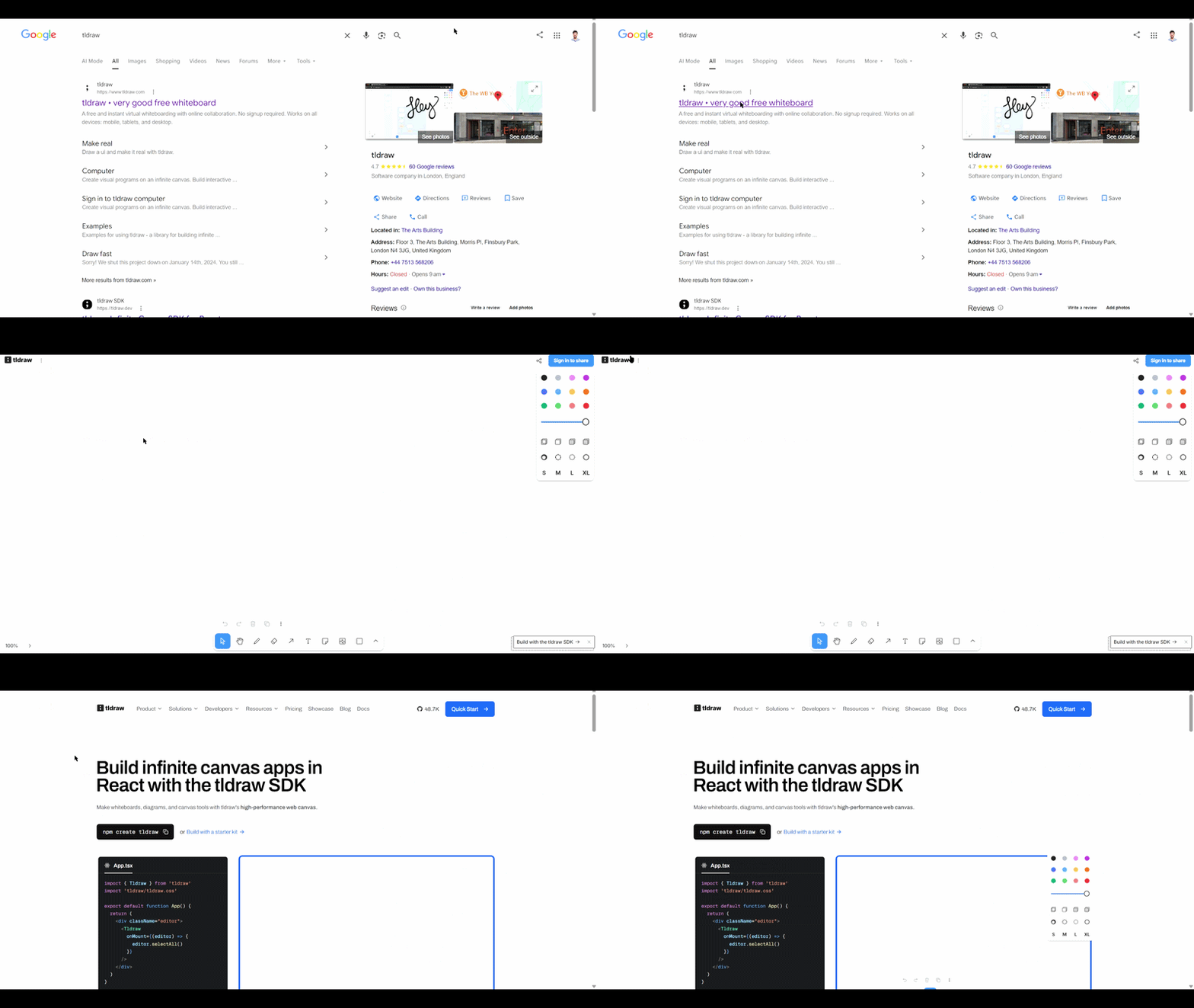 By the time developers reach the SDK, they already understand what they're building because they've interacted with the product itself.
Steal this: If your product can explain itself through use, let developers experience it immediately. Put documentation, SDKs, and implementation guides one click away, ready for the moment they decide to build.
8. Railway: Build two front doors
Key takeaway: Your website now has two audiences: humans and AI agents.
I discovered this by accident while using Claude Code.
I asked Claude to fetch railway.com expecting it to read the homepage. Instead, Railway detected the AI agent request on the server and served a completely different page: https://railway.com/agents.md Humans land on the marketing homepage. AI agents land on structured Markdown with instructions, workflows, CLI commands, and implementation guidance.
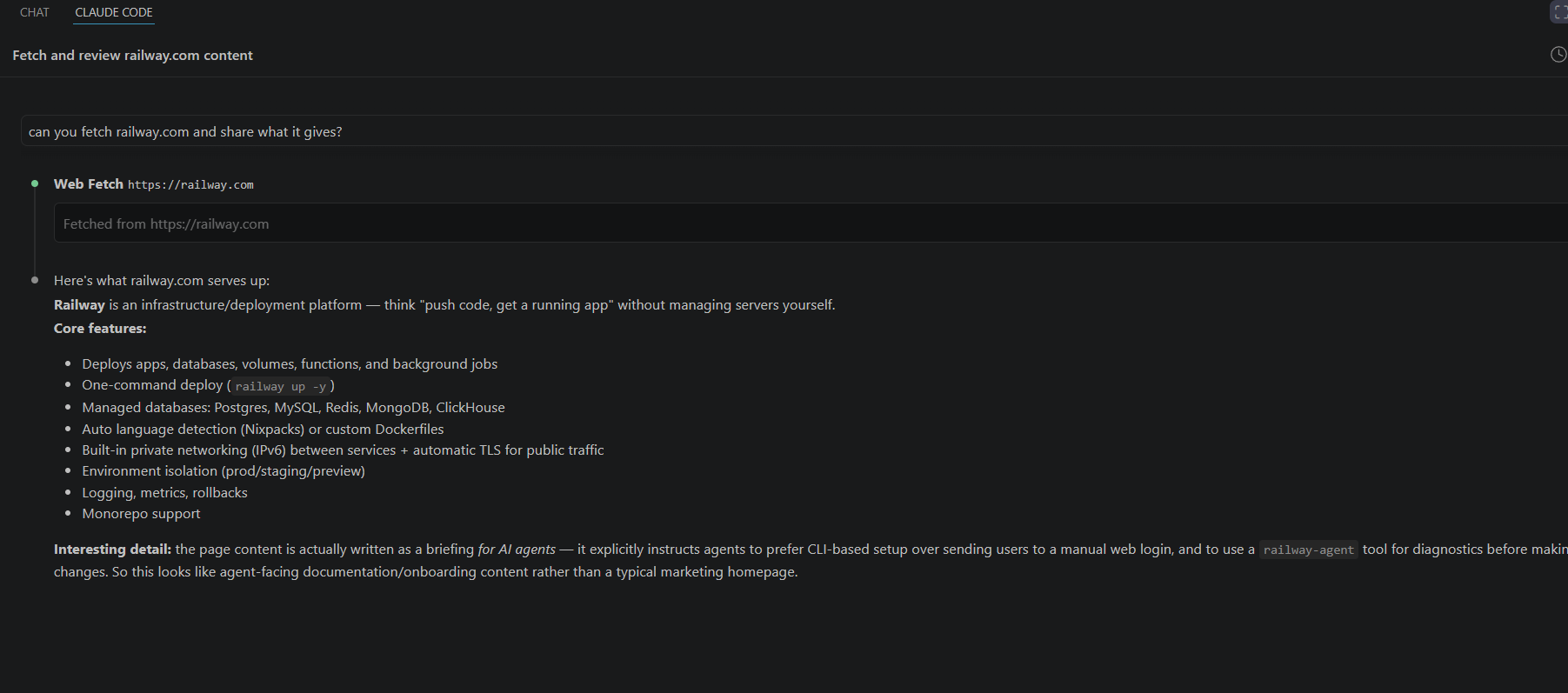
Railway has effectively built two front doors. One is designed to persuade developers. The other is designed to instruct AI agents. Both lead to the same product, but each is optimized for how its audience consumes information.
Steal this: I wouldn't recommend implementing agent-specific routing just yet. Railway is experimenting with something few companies are doing today.
What you should do today is prepare for the second front door. Publish llms.txt, make your documentation available in Markdown, and structure your content so AI agents can retrieve accurate information. Your homepage is no longer the only entry point to your product. AI agents are becoming one too.
9. Resend: Start from the developer's stack
Key takeaway: Don't make developers translate your examples into their stack.
Resend knows developers don't all write JavaScript. Some build with Go, Python, Rust, Bun, PHP, or plain SMTP. Instead of showing one universal example, the homepage lets developers switch to their language and framework, updating the code instantly.
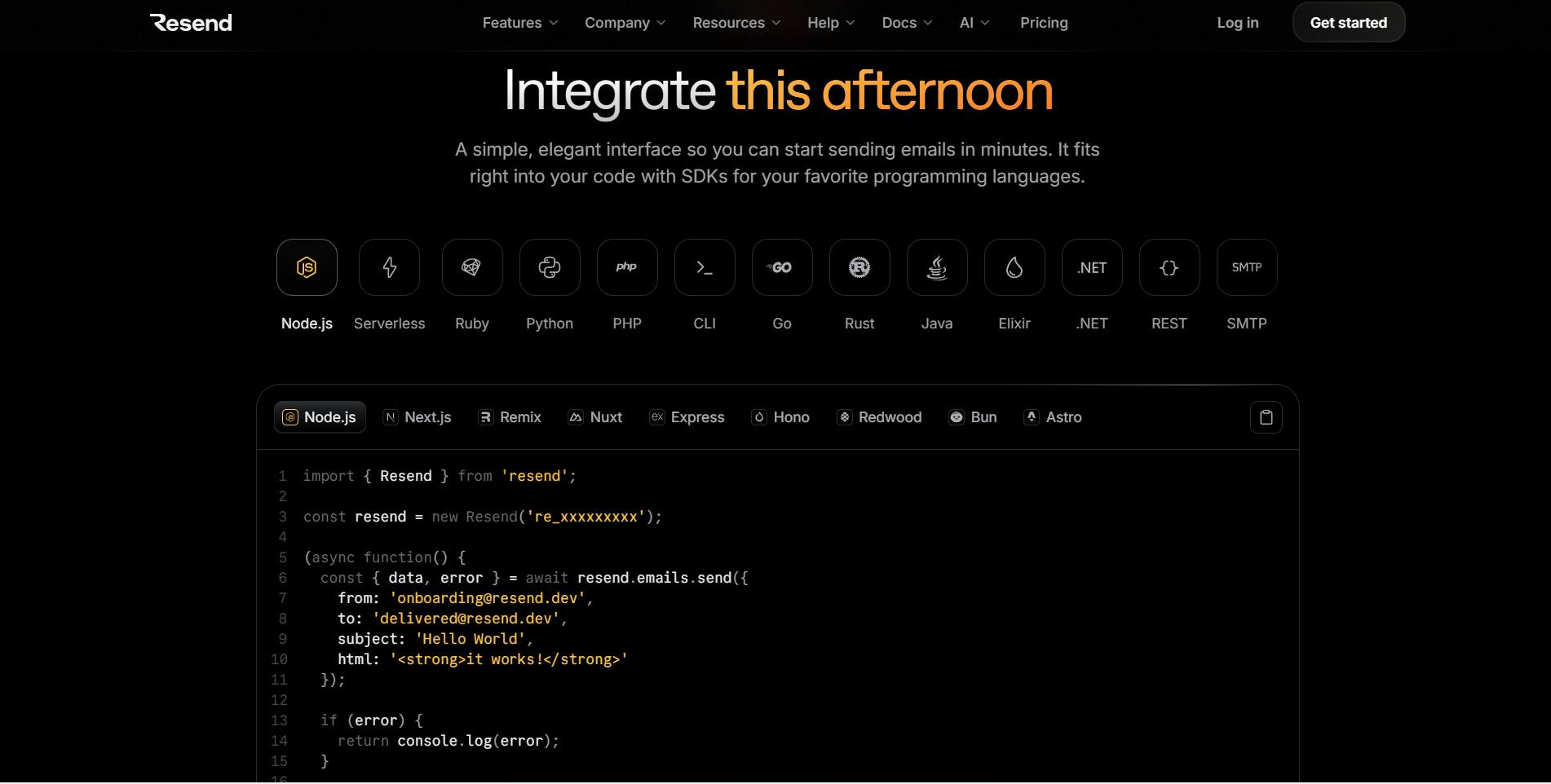 Every developer arrives with an existing stack. The first question isn't "Can this send emails?" It's "Will this work with the tools I'm already using?" Resend answers that question before developers have to open the documentation.
Steal this: If your product supports multiple languages, frameworks, or platforms, don't make developers hunt through your docs to find the right example. Let them choose their stack on the homepage and show implementation examples that match it. The less developers have to mentally translate your examples, the faster they'll start building.
10. Astro: Make verifiable claims
Key takeaway: If your biggest differentiator is measurable, make it verifiable and reproducible.
Every framework claims to be fast. Astro knows developers won't take that claim at face value, so it backs it with verifiable, reproducible data. Instead of publishing internal benchmarks, the homepage compares the percentage of real-world websites passing Core Web Vitals using data from the HTTP Archive and Chrome UX Report.
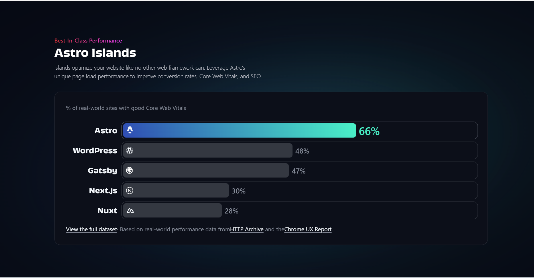 From a developer's perspective, this removes the need to search for third-party benchmark articles or wonder how the numbers were measured. The data comes from public sources, making it easy to verify and reproduce. When your biggest claim can be independently validated, it carries far more weight than any marketing headline.
Steal this: If your product wins on a measurable metric, prove it. Use public datasets when they're available. If you have honest internal benchmarks, publish them openly and explain how you measured them. The strongest technical claims are the ones developers can verify and reproduce themselves.
Wrapping up
One thing every company in this article gets right is that they respect developers' time. They make it easy to understand the product, see where it fits, and know what to do next.
If I were redesigning my homepage tomorrow, I'd start with one question:
What is the first question a developer wants answered about my product?
The answer should be obvious within the first few seconds. Every screenshot, code example, benchmark, customer story, and interaction should reinforce that answer. Anything else can live in your documentation or product pages.
FAQ
It tells a developer what the product is, why it matters, and how to start within a few seconds. Every homepage example in the post respects the visitor's time.
The post covers Linear, Bun, Better Stack, Raycast, Sentry, Trigger.dev, tldraw, Railway, Resend, and Astro, each for one specific thing it does well.
Yes. Linear makes the product the hero image, and tldraw drops visitors into a working canvas so they use it before they read about it.
Serve a version agents can read. Railway detects AI agents and returns a format built for them alongside the human homepage.
With numbers developers can check. Astro links its speed claims to reproducible benchmarks.
About author
From SEO and growth campaigns to documentation, landing pages, and developer-focused content, the list goes on! My passion lies in helping products connect with developers and driving measurable results through thoughtful marketing. Outside of work, you’ll find me chasing new adventures, gazing at the moon, and enjoying the timeless charm of old Hollywood movies.











.svg)